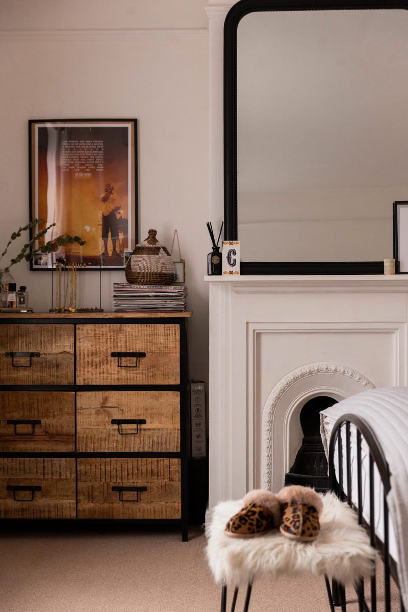
Three years: that's how long we've been in this bedroom. Three years of double-ending the bed sheets as we re-dress the duvet; three years of nomadic socks inching out from crooks and corners; three years of awful curtains and dusty mirrors and babe I've left it too long, will you make me another tea? Three years in a bedroom which isn't entirely our own, the items inside it collected tokens of our lives as we bundle through our twenties in a blur of delight and confusion.
Decorating this room has been a slow labour of love; interior styling doesn't come naturally to me and I find it difficult to make final decisions for fear of changing my mind and consequently wasting money. The bedroom has always been my favourite room in our home though, and as the years have gone on and I've added to and taken away, I've honed in on a few tips for decorating a rented bedroom which don't require major changes, can be enacted in stages and so are kinder to the bank balance and won't piss off your landlord.
Styling a rented room can be tough when you know you might not live in it for a long time. You don't want to invest shed-loads of time and money only to be told you have to leave two months later at your landlord's behest, but there are still smaller changes which will make the space more personal. And that's what's important, right? Creating a refuge which feels like your own (even if it isn't).
If you fancy a peek at the original bedroom tour post before you continue reading, you cand find it here.

Choose one piece of 'best bit' furniture
Decorating a bedroom from scratch can be confusing (at least I found it to be). Will this go with that? Is this the wrong shade? Am I playing it too safe? I want everything to look nice - more than nice - but I'm struggling to picture it together. Should I start ANOTHER Pinterest board? If this is you, simplify the job and choose one piece of 'best bit' furniture to start. Find something you love and let it lead the way for other items in the room.
Ours is our chest of drawers. We bought it from Wayfair so it's not a one-off vintage piece or anything especially custom made, but we love it and elements of the design have lent themselves to the other furniture pieces in the bedroom which made it easier to create a cohesive look without trying too hard. Black metal and wood are easy to work with, especially against an otherwise minimal aesthetic. Now we have the black mirror, the metal bed frame, various other wood tones and textures throughout the room. Choosing one piece as a solid starting point makes it easier to piece the rest together.
Your 'best bit' should be something that follows you from home to home, when and if you move. It doesn't have to be expensive, but it should be something special to you.
Chest of Drawers - Wayfair (affiliate)
Jewellery holder - Flying Tiger

Combine textures for depth
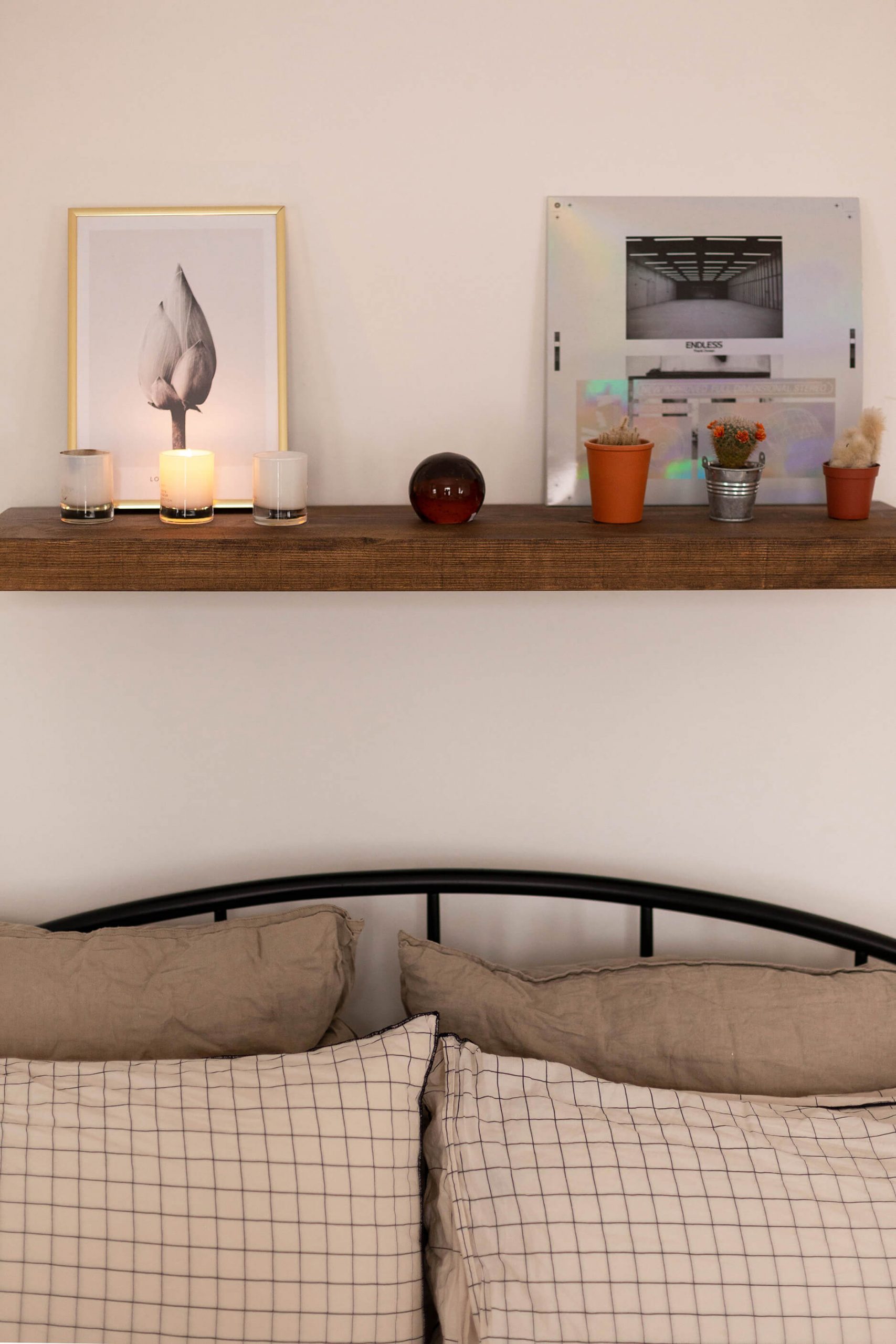
Layer textures throughout to give a minimal bedroom more depth and interest. Rented spaces are typically quite barren of personality and if your landlord doesn't allow major changes or you simply can't be arsed, introducing various textures to the room helps to give the illusion of intentionality. It's supposed to be this plain, it's a design feature.
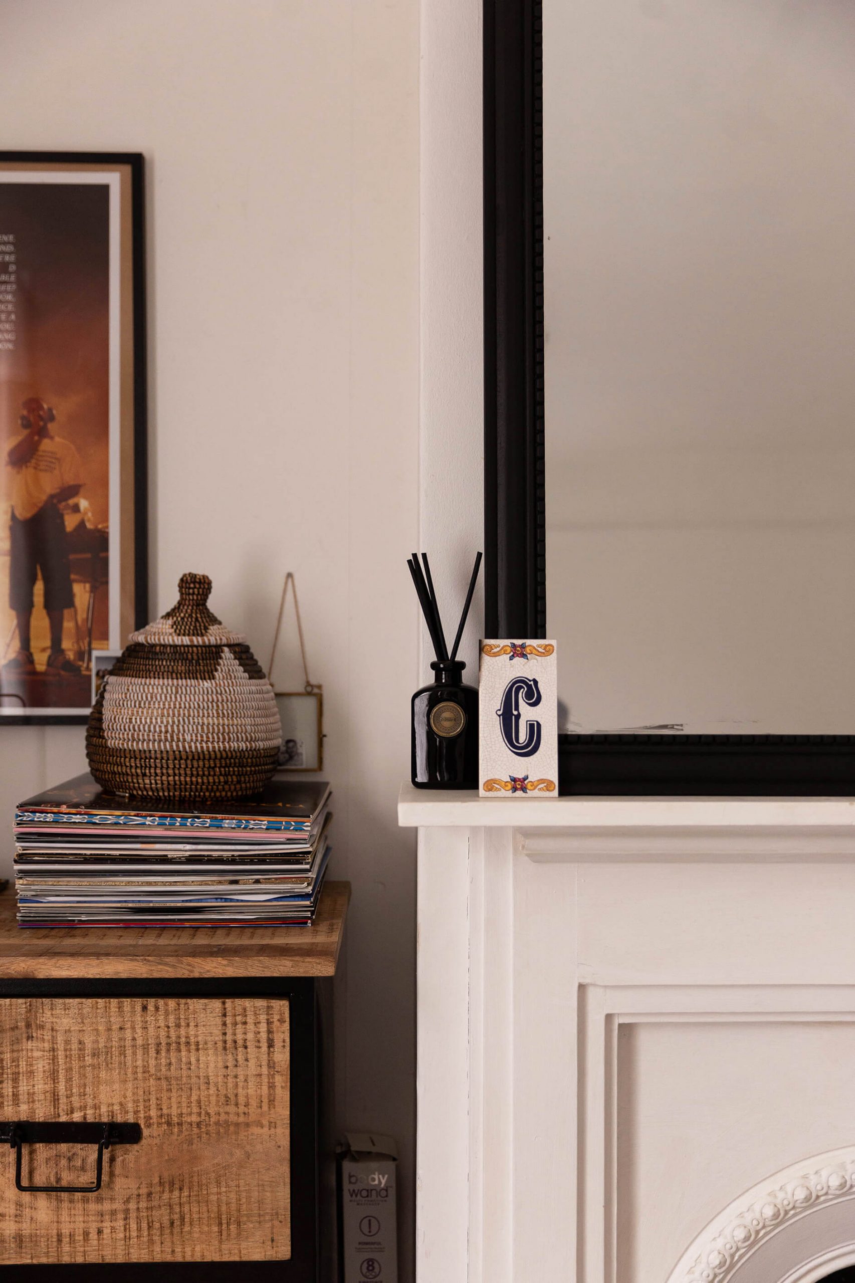
Woods, weaves, baskets, linens, throws, stools, rugs, curtains, even metal bins: make it more interesting by cooking up a medley of finishes.
(Yes that is a BodyWand box. Read this if you want to know more about it.)
Shelf - Etsy (affiliate link)
Print - Desenio (gift)
Bed frame - Original Bed Co.
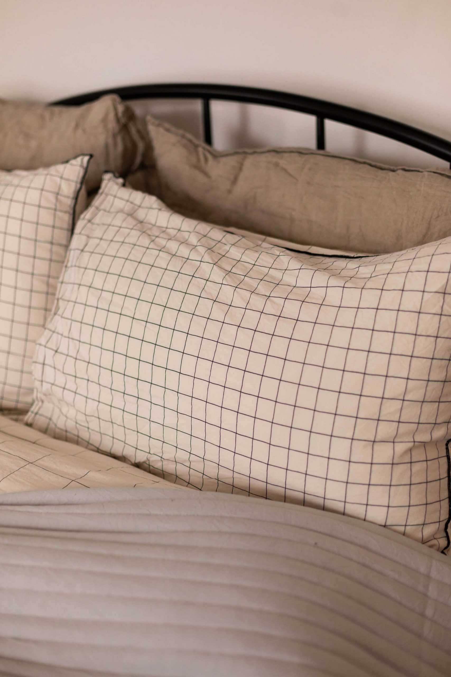
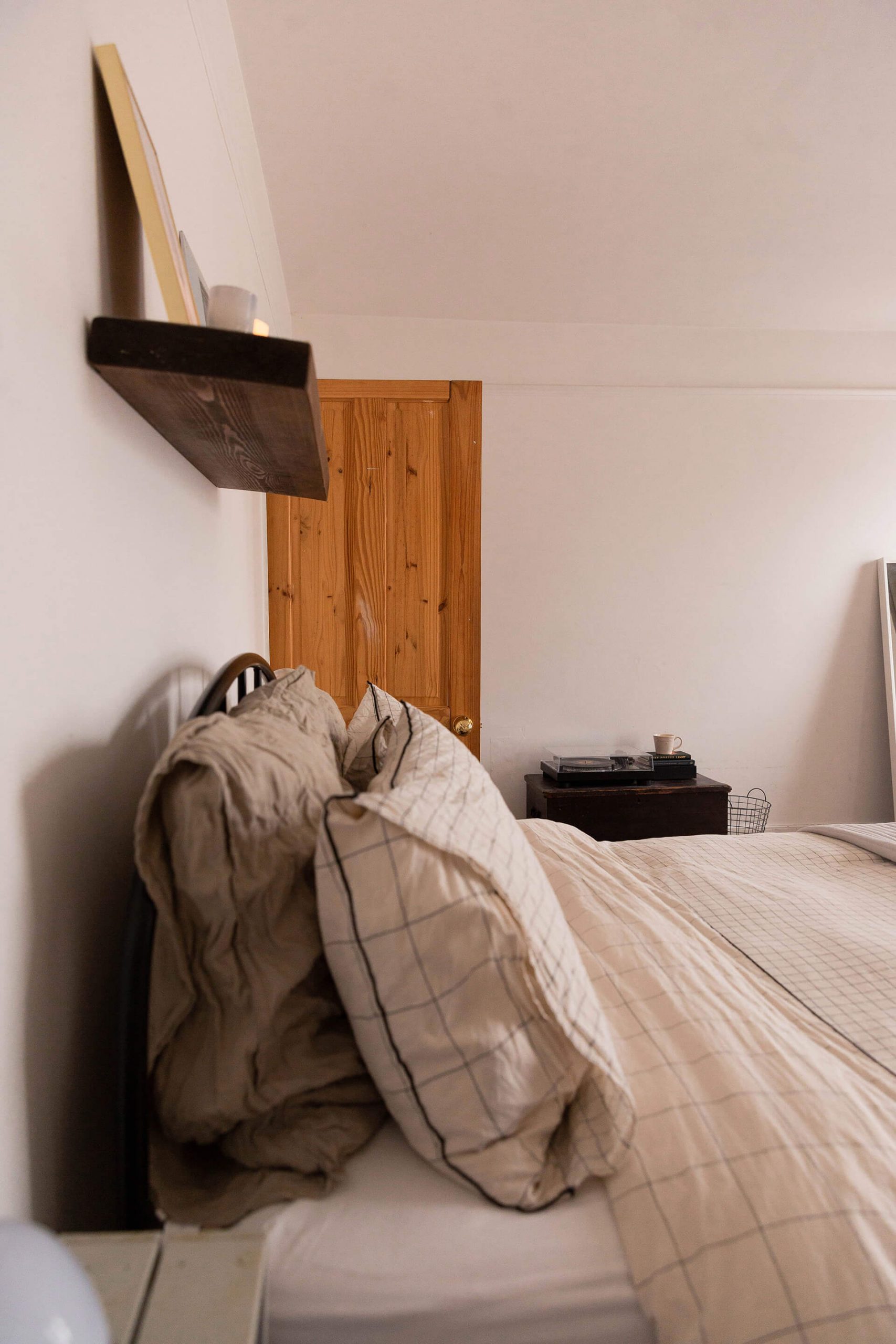
Approach your bedding in layers
Bed linen is a focal point of the room so treat your bed like a mille-feuille (I've been watching Celebrity Bake Off and it shows). Approach the linen in layers, mixing shades, textures and fabrics to make it look more expensive. If interior bloggers and fancy hotels do this, we will too.
An easy way to add an extra dimension to your bedding is to upscale the back pillows. I'm a big advocate for these chunky squares; they're great for lounging and for supporting big heads *cough*Keiran*cough*, plus they offer extra height so your bedding is neatly stacked.
If you're going for neutral bed covers, add a new texture, colour or print to the back pillows. We've got a selection of dark grey, navy and beige options which work interchangeably with all of the different bed sets so any can be pulled from the clean washing pile. Oh, and get a double-sided bedspread or throw whilst you're at it. Two looks in one!
I've seen some recommendations for going up a duvet size to make the bed look more luxurious. We've never tried it but it could resolve any duvet-hogging issues if you don't mind forking out the extra cash for larger covers.
Bed set - La Redoute
Square pillows - La Redoute
Square pillow covers - La Redoute
Bedspread - Dusk (gift)
To hang or not to hang? That is the question
If you can't hang things on the wall
I’ve never found the alternative wall adhesive options to work so personally, I wouldn't bother with those unless the item you want to hang is quite small. Most of the time they eventually peel off and you risk patchy paintwork and breaking whatever it is you put up in the first place. Instead I'd find some extra large picture frames and lean those against the wall, embracing the minimal look by stacking books, plants and other personal trinkers for a very Pinterest-chic vibe. Mirrors are obviously great too and large dried stems like pampas grass can break up big blocks of empty space.
If you can hang things on the wall
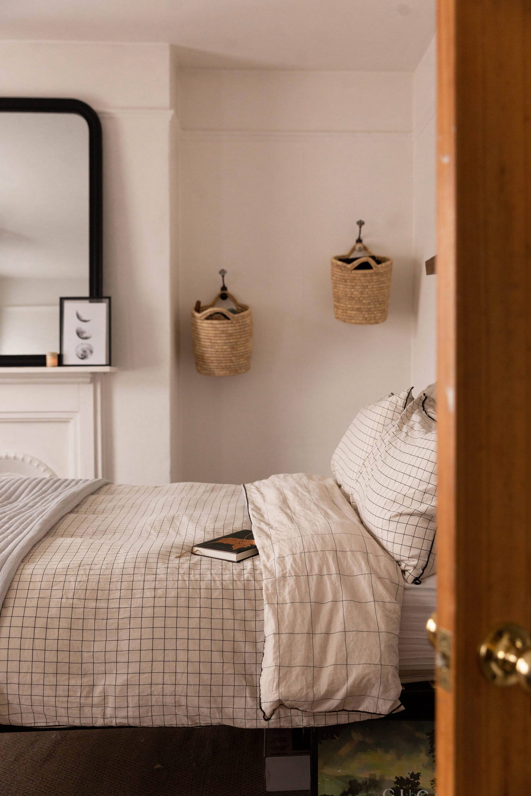
Do so sparingly, bearing in mind you’ll have to fill these holes when you leave. We have one print up, two baskets (one fell down lol) and a shelf.
As an alternative to artwork and prints, try vinyl holders, storage baskets, book shelves, wall hangings, large fans etc. Pinterest - as always - is a great source for different ideas.
Mirror - La Redoute (gift & affiliate link)
Baskets - H&M Home
Moon print - Desenio (gift)
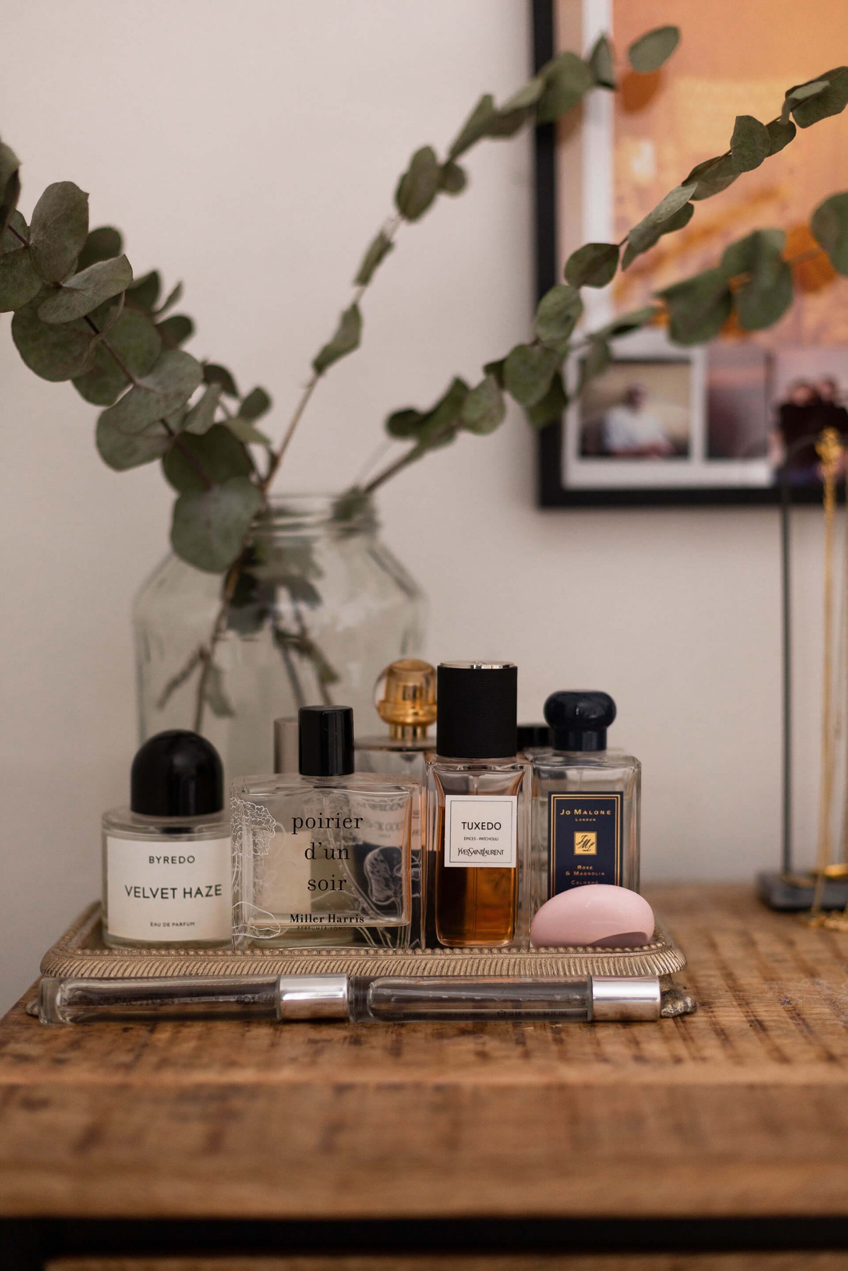
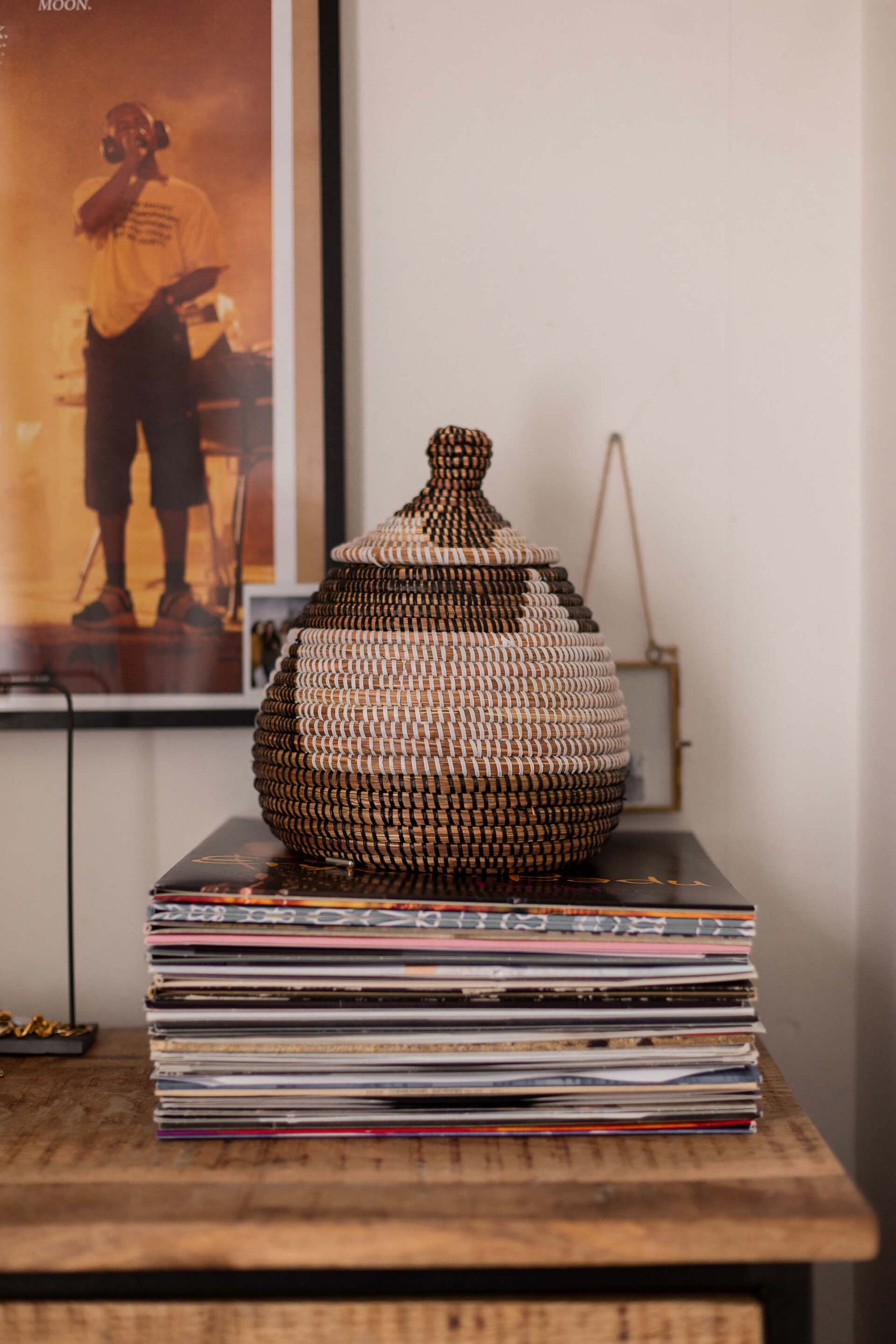
Don’t just style the bedroom to an aesthetic, make it a personal space too
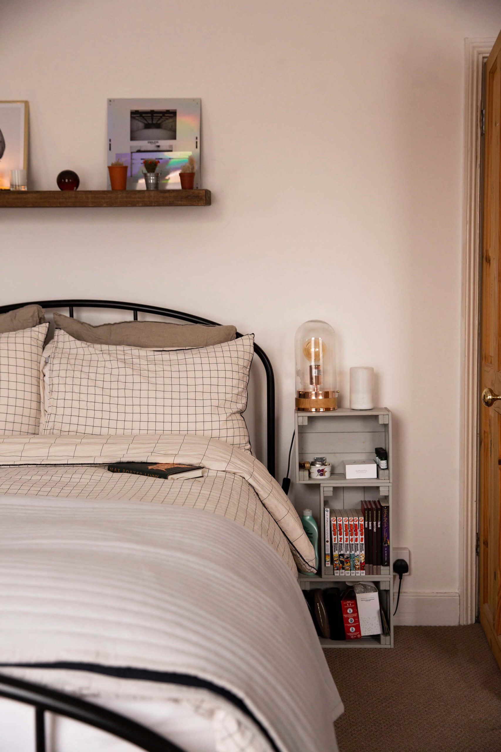
If you don't have a natural flair for interior decoration then you may lean towards styling your bedroom purely for the aesthetic, a temptation I know all too well. Try not to be too swayed by Instagram and Pinterest, however. Create a space which feels right for you and your taste, and which exhibits all of the trinkets and treasures you've collected up to this point.
We have a stack of vinyl records, music references littered around, little polaroids of parties and birthdays and sunny afternoons in the garden. Our books are on show, slippers are out, perfumes displayed and jewellery lined up. Yes, you want the bedroom to look nice, but make sure it feels like home to you as well. That's the difference between a bedroom which is great for photos and a bedroom which is great for living.
 Idle Waters: Quaint Cottage Countryside Retreat
 Why Solo Travel & Why Now? What Solo Trips Mean To *Us*
 Unplugged Retreat: A ‘No Phones’ Countryside Break
 New Home Tour


