Algorithms, themes, optimal posting times – just when did Instagram get so damn tricky? Long gone are the days of “oh shit, that’s cute, let me post that now”, and the likes of Amaro and Juno are a thing of the past (Valencia has always been a shit filter, and we all know it too). Don’t get me wrong, the ‘gram will forever be my favourite platform. As a teenager I used to organise mini-photoshoots with friends and wannabe models from my town (I actually wasn’t terrible – see here for rl evidence) so photography and image sharing is always something that’s come naturally to me. It’s no surprise then that I found my way into blogging, and that Instagram has become an integral part of what I do.
In being an integral part of my job, however, there’s a certain amount of pressure that comes with it. I have to get my uploads right, or I potentially jeopardise my biggest platform for sharing my work. This is the same for most bloggers, and so we’ve found ways to make sure everything looks *just right*. Thus Instagram themes were born – a way of looking at the Instagram theme as a whole *flowing* entity, rather than a base for individual, non-associating single uploads. But how far has the Instagram theme gone on to hinder creativity and expression, rather than help?
I’ve recommended Instagram themes in the past, but I’ve also questioned them, asking how far is too far? I yoyo between thinking they are extremely beneficial to thinking they are extremely limiting, often finding myself coming to a decision at somewhere in between. I, myself, have dipped in and out of themes, switching it up occasionally by changing my filter or finally breaking out of the white wall background rut (all of my images ended up looking the same, and whilst this is great for keeping a blanched out theme, it’s not great for making outfits look exciting). I used to use the VSCO filter F2, and now I use A6, and if your an Instagrammer, you’ll know how ridiculously big of a deal changing your core filter can be *first world problems*. Over the past few months, however, I’ve found myself largely abandoning the rules I previously lived by.
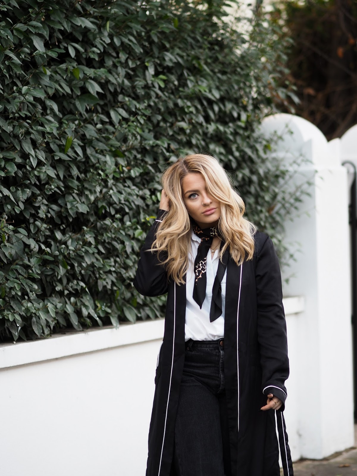
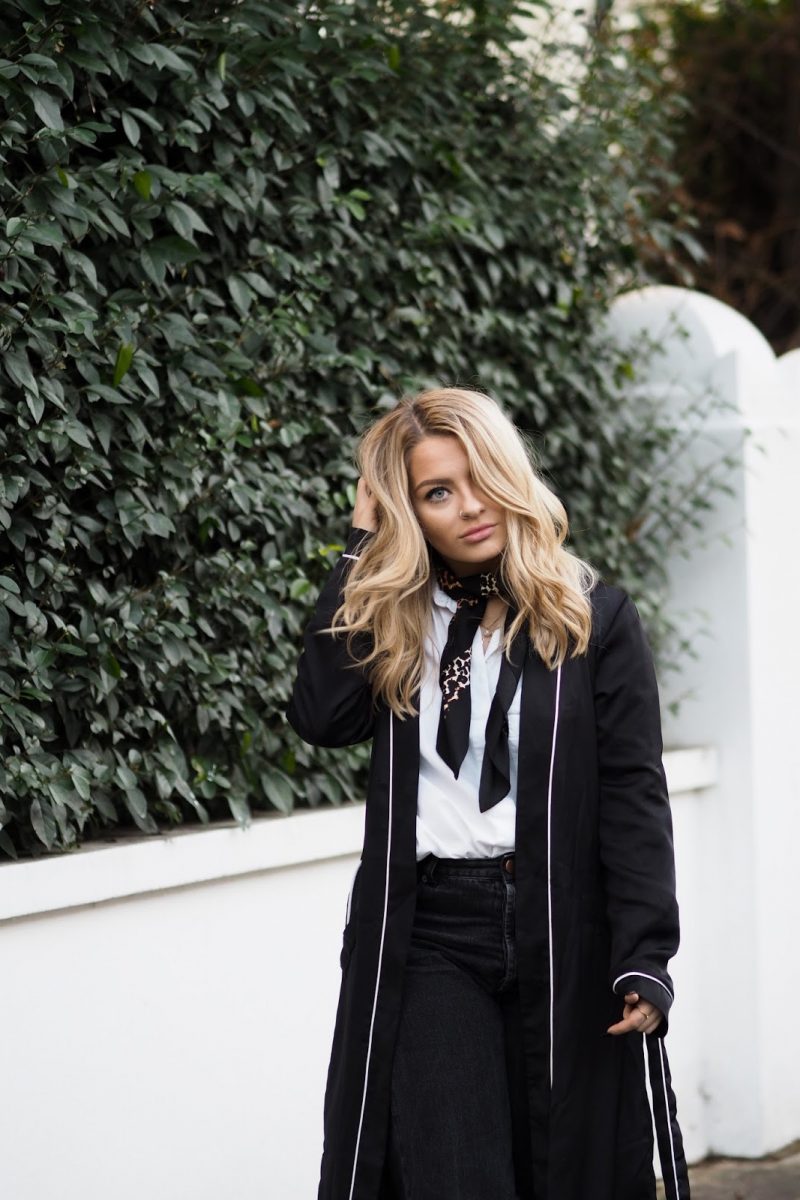
These aren’t the best set of photos to demonstrate my point, but there is still something in them; previously I would have banished all greenery from my feed, trying to keep it as neutral and monochromatic as possible. All hues were desaturated and the tone was cooled down to an icy blue, with the exposure amped way way up to make the whites as bright as possible. This led to an over-edited, contrast-city-central finished product, but it fitted perfectly into what I thought was most important: a cohesive, light, bright and white theme. That’s what was successful, so that’s what made sense to do, right?
We don’t see the full feed when we enjoy our 26th scroll of the day through Instagram, instead we see a sea of single images. In a way then, doesn’t the single image trump the overall feed? If we’re stopping ourselves from sharing an image that we love just because it doesn’t *fit*, are we not stopping ourselves from doing the one thing that as content creators we should be doing – sharing work that we are passionate about? If we’re uploading #Pinspo shots just because it ties into a certain colour from last Wednesday’s evening upload, are we not losing the honesty of what we share? Since taking the blockers off of myself and stressing less about my overall theme, I feel like the quality of my individual images has only improved. I spend more time thinking about how a single shot works in its own rights – the composition, lighting, pose – rather than how it will fit alongside my other pictures. I’m creating images for the beauty of the single image, rather than creating images to populate a feed.
How much do you think about your Instagram feed? Does it play a big part in how and what you share? Let me know in the comments down below or find me over on Twitter and Instagram. Instagram is an ever-evolving platform and as it’s my little darling, I’m always keen to hear your views on how you think the community is developing!
 Idle Waters: Quaint Cottage Countryside Retreat
 Why Solo Travel & Why Now? What Solo Trips Mean To *Us*
 Unplugged Retreat: A ‘No Phones’ Countryside Break
 New Home Tour


